

Benchmarks: beware!


How does my customer service compare to competitors? What do we do well, and what could we do better at? What should be our targets for the future?
When looking for answers to these important questions, it can be tempting to seek out benchmark data. The KPIs of competitors in the same industry are intuitively a good place to start when thinking about your own organisation’s performance.
But, when used without context, benchmark data can cause more harm than good, driving the wrong investments in the wrong targets.
An example to illustrate my point. Based on this table, which of these banks has the best performing customer service operation?
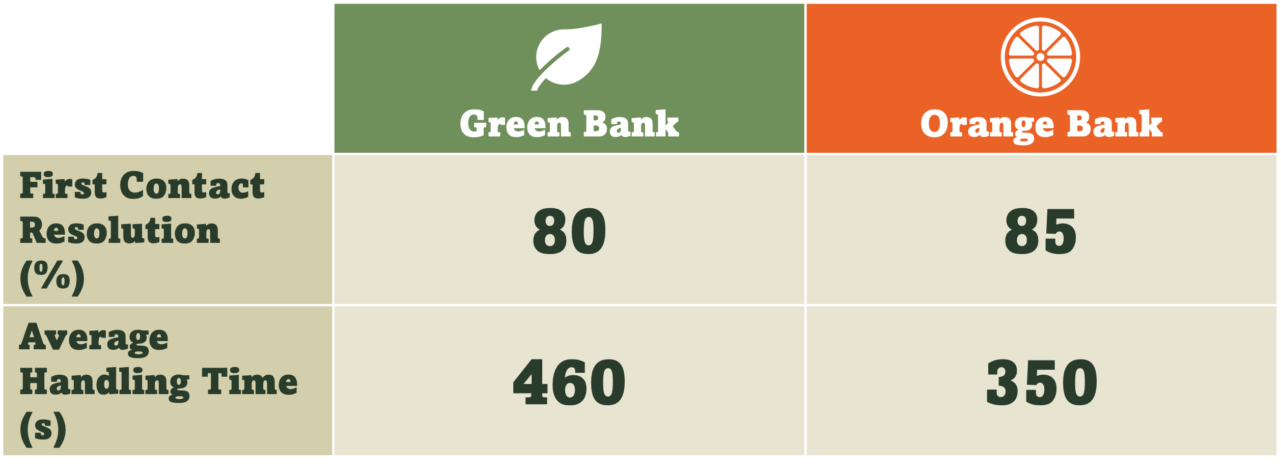
Instinctively, Orange Bank seems to be the winner. More contacts resolved right first time, and less time to resolve each contact.
But, if we widen to aperture to compare the types of requests coming into the contact centre, the picture changes:
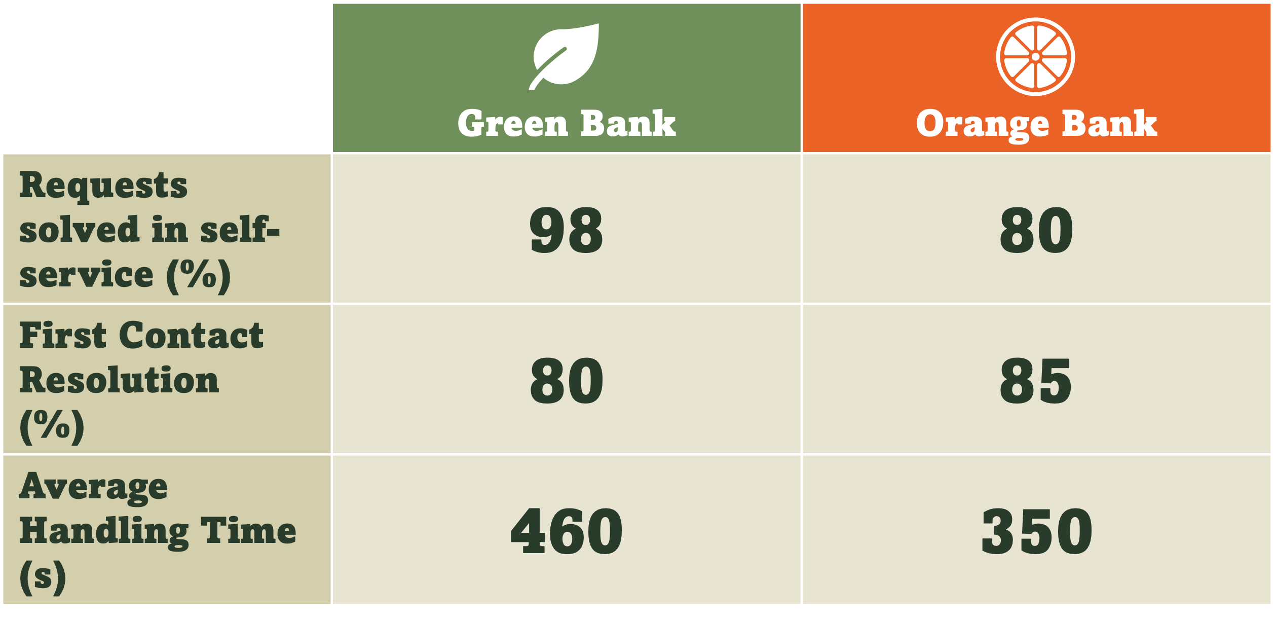
We can now see that for Green Bank, almost all (98%) of customer needs are successfully resolved through self-service, whereas for Orange Bank only 80% are handled in self-service. This implies that a much smaller volume of contacts are being handled by Green Bank’s contact centre. Proportionally, these contacts are more likely to be complex requests, so it’s understandable that they would take longer to handle, and would be harder to resolve in the first contact.
Arguably, based on this new information, Green Bank is actually the better performing bank.
Some of the most useful data points are the hardest to benchmark
But the problems don’t stop there. Are we really comparing apples with apples?
Let’s unpack what the metric, Requests Solved in Self-Service (%) actually means.
It’s a percentage, so it is a value expressed as the ratio of another value. Probably something like:
Calculating a consistent, benchmarkable number for this fraction is not straightforward:
There is usually no consistent definition for a digital request. If a customer logs into their banking app every day to check their balance, does each login count as a request? It is unlikely that they would have gone to the effort of calling the contact centre if the app wasn’t available, so we can’t think of the digital interaction as a substitute for a call. Last year, Bank of America calculated that their customers carried out 26 billion digital interactions in 2024. With numbers this big, calculating a ratio of digital to non-digital interactions seems meaningless
In addition, whilst it is relatively easy (if the data is available) to measure how many interactions are happening in the digital channel, it is more complex to work out if the request was actually solved. This can be estimated by checking for repeat contacts in other channels, but that is a time consuming exercise
So, if reliable and consistent benchmarks are so hard to collect, how can one customer service operation compare itself to the best standard?
The vital few - the benchmarks that work
The good news. There are a small number of metrics that work really well as benchmarks: they can be defined and measured consistently, and can be calculated using data points that most companies already have to hand.
1. Human-handled contacts per customer - indicator of customer effort
The calculation for this one is simple:
This works as a measure of self-service effectiveness without worrying about what to count as a self-service interaction. What we care about here is how often a customer needs to interact with a human. The better the self-service, the lower the ratio.
Even better to double-click on this metric to see a distribution curve showing the percentage of customers who contacted 0, 1, 2, 3,… times in a given period.
2. Customers per Customer Service Representative (CSR) - indicator of productivity
Very similar to benchmark (1):
When combining benchmarks (1) and (2), we can get a good picture of the effectiveness and efficiency of a customer service operation, compared to peers, and isolate how much of the difference is due to customer demand or due to internal efficiency.
3. Maturity assessment - a qualitative benchmark
Now, here’s the trick. Rather than rushing to benchmark lower-level metrics (AHT, FCR, ASA etc.), first do a qualitative assessment of capabilities vs. competitors. The types of questions you might ask include:
What channels are offered?
What needs can be resolved through self-service?
How multi-skilled are the teams?
Where are contact centres located?
Much of this information can be discovered outside-in, without having internal knowledge of other companies.
Then, at this point, benchmarking low-level metrics like AHT and FCR can be useful, but only after the context is well-understood. That’s a more reliable approach to set targets and prioritise the right initiatives to achieve them.
Recommended links
Fortune: For success in AI, avoid the ‘efficiency trap’— and focus on trust instead
TechCrunch: Airbnb says a third of its customer support is now handled by AI in the US and Canada
Techzine: Major hack of Dutch telco Odido was a classic case of social engineering
Harvard Business Review: Do you know what your customers’ aspirations are?
Latest perspectives from BCG
Six questions for CIOs as GenAI transforms IT sourcing
The traditional economics of sourcing are changing for IT functions in Europe, with GenAI enabling 20% to 40% efficiency gains by automating coding, testing, and support tasks. As a result, the relevance of traditional low-cost, labor-scale sourcing models is fading fast.
In this new paradigm, the focus is shifting from volume-driven outsourcing and routine execution towards high-value, innovation-oriented partnerships.
Traditional offshoring and labor arbitrage is giving way to AI-enabled hubs, and Europe’s regulatory maturity puts the region in the spotlight.
Love this “vital few” framing, Nick. Human-handled contacts per customer and customers per CSR are such clean, reality-check metrics when everyone’s still obsessing over AHT and FCR in a vacuum.
I actually just wrote about Five CX Metrics That Make Executives Sweat over on Decoding Customer Experience, and your piece pairs really nicely with that idea: stop worshipping the easy-to-track numbers and start looking at the ones that make people a little uncomfortable.
https://www.dcxnewsletter.com/p/five-cx-metrics-that-make-executives-sweat?r=6ook&utm_campaign=post&utm_medium=web